Basics of Auto Layout in Swift 4
When programming mobile applications, one of the most important things to take care of in your app is the User Interface (UI). Pleasant looking UI, accurate placement of views and smooth animations go a long way in boosting the user experience of your app. The design and placement of your views within your app can be done in a very straightforward manner - simply specify the height and width of your view, the x and y positions and there you have your view. However, with the introduction of more and more devices over the years that have varying screen sizes, dimensions and area, you will find that this method becomes rather unreliable. For instance, a button placed at the center of the screen of a iPhone 8 using specific x and y pixel positions will not be in the center of the screen on an iPad Pro. In a similar vein, many modern apps support both portrait and landscape orientations, and using exact positions and dimensions will most likely not have your views positioned correctly. Accounting for every single screen size and orientation in your code is one possible get-around, but this makes the development process extremely tedious and hard to scale and maintain. The proper solution? Auto layout!
What is Auto Layout?
Auto layout is a layout system that works upon constraints and anchors. As developers, we just have to tell each of the views how it should be placed relative to the screen or relative to the other views, and auto layout will take care of itself and adapt all the views according to the device’s screen size and dimensions. No more having to painfully estimate or measure exactly how many pixels a label should occupy or what the ideal pixel height for the button should be. We can simply assign constraints and anchors to each view, and let auto layout decide for you.
There are two main ways to use auto layout: using the storyboards/interface builder, or completely in code. In this post, I will only be giving and introduction of how to implement basic auto layout in code (i.e. programatically), because this is my preferred method of creating iOS applications. Perhaps I will write a future post comparing developing apps programatically vs. using interface builders, but for the purposes of this post, it will be in 100% code.
Analysing UIView and layout anchors
UIView is the main case class for all the different UI elements provided in UIKit, including UILabel, UIImageView, etc. It is thus important to understand how UIViews work, and in what ways can it be manipulated to be displayed in your preferred manner. To start, it is important to know what ‘layout anchors’ are and what kind of anchors are available for you to use for a UIView.
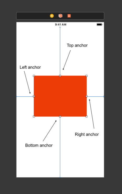
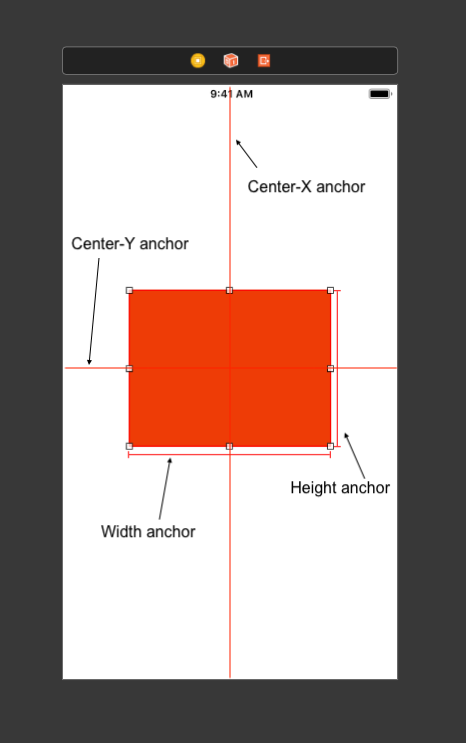
Auto-layout’s layout anchors can be of 3 types: NSLayoutXAxisAnchor, NSLayoutYAxisAnchor and NSLayoutDimension, all derived from the base NSLayoutAnchor class. From these 3 classes, there are a total of 12 different layout anchors that you can use on a UIView to place it in the manner you want, 8 of which (to me) are the basic and most important:
NSLayoutXAxisAnchor: Left Anchor, Right Anchor, Center-X Anchor
NSLayoutYAxisAnchor: Top Anchor, Bottom Anchor, Center-Y Anchor
NSLayoutDimension: Height Anchor, Width Anchor
I like to think of NSLayoutXAxisAnchor and NSLayoutYAxisAnchor as “hooks”. When I’m coding out the UI, I like to imagine how the first view in my applications “hooks” onto the main window, how the next view “hooks” onto the first view, and so on. NSLayoutDimensions can be set to a constant, or set to match another NSLayoutDimension. With this way of thinking, I give my views “instructions” on how they should be placed, and the auto layout system automatically adapts the views according to the screen size of the device. The following is a very simple example of a red 100x100 square placed in the center of the screen:
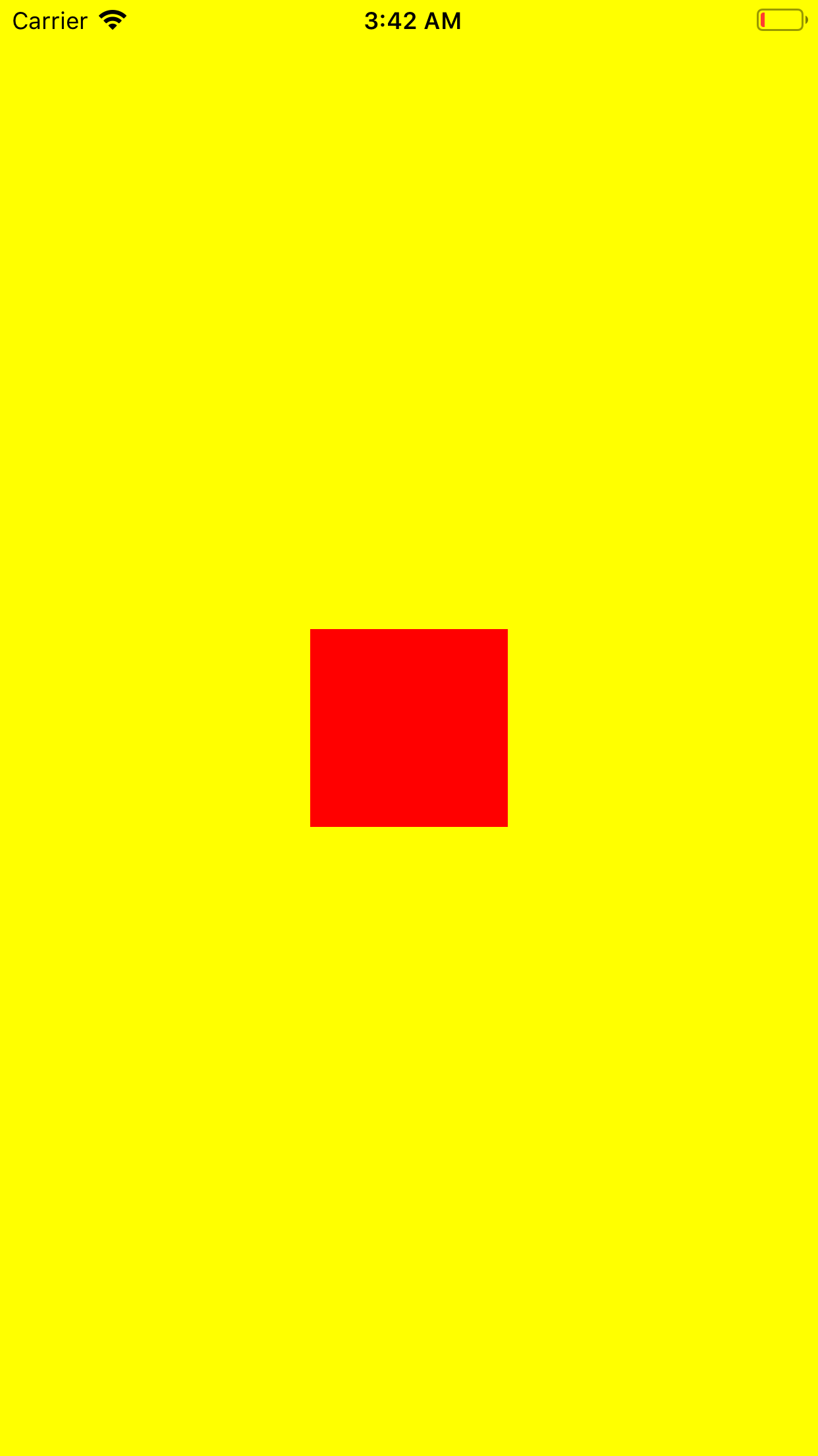

This was accomplished with just the following 4 lines of constraints:
redView.centerXAnchor.constraint(equalTo: view.centerXAnchor).isActive = true
redView.centerYAnchor.constraint(equalTo: view.centerYAnchor).isActive = true
redView.heightAnchor.constraint(equalToConstant: 100).isActive = true
redView.widthAnchor.constraint(equalToConstant: 100).isActive = true
By simply constraining the center-X and center-Y anchors of the redView to the center-X and center-Y anchors of the main view respectively, I pin the two views’ center axes to each other. Then, I give a constant value of 100pts to the height and width anchors, resulting in the screengrab above. Notice that in landscape mode, the layout automatically adapts accordingly to my anchors!
I believe there is no hard and fast rule for this, but as a general intuition, you should always have at least enough constraints for auto-layout to know where to position your view and what the size of your view should be. If you give a view top, left, bottom and right anchors, auto-layout will know exactly which area and how large your view should be. If you only specify 2 position anchors (for e.g. top and left anchors), then you have to specify 2 dimension constraints as well (for e.g. height and width), so that auto-layout knows where to position your view on the screen and also how large it should be. In any case, XCode will give a warning in the case of inadequate constraints, so there’s not much to worry there.
Shortcut: UIView extension
You might be thinking now that if a simple red square requires 4 lines of code already, what more for huge and large scale apps? Yes, the code can get long and messy pretty quickly, and thus I like to include this UIView extension function to allow me to anchor my views easy with just one method! Credits to LetsBuildThatApp for introducing this idea in his many iOS tutorials, and I have adapted his solution to suit my preference as much as possible. Note that not all 12 possible constraint types are included in this method, but you can easily add them wherever required!
import UIKit

extension UIView {

    func anchor(top: NSLayoutYAxisAnchor?, left: NSLayoutXAxisAnchor?, bottom: NSLayoutYAxisAnchor?, right: NSLayoutXAxisAnchor?, paddingTop: CGFloat, paddingLeft: CGFloat, paddingBottom: CGFloat, paddingRight: CGFloat, width: CGFloat, height: CGFloat) {

        translatesAutoresizingMaskIntoConstraints = false // This is required for auto-layout constraints to work. Don't forget this line!

        if let top = top {
            topAnchor.constraint(equalTo: top, constant: paddingTop).isActive = true
        }
        if let left = left {
            leftAnchor.constraint(equalTo: left, constant: paddingLeft).isActive = true
        }
        if let bottom = bottom {
            bottomAnchor.constraint(equalTo: bottom, constant: -paddingBottom).isActive = true
        }
        if let right = right {
            rightAnchor.constraint(equalTo: right, constant: -paddingRight).isActive = true
        }
        if width != 0 {
            widthAnchor.constraint(equalToConstant: width).isActive = true
        }
        if height != 0 {
            heightAnchor.constraint(equalToConstant: height).isActive = true
        }
    }
}
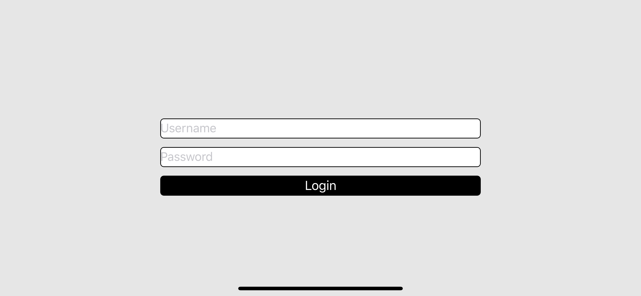
Simple login page - Sample Project
Armed with the information you have learnt in this post (and basic iOS programming knowledge enough for your first ‘Hello World!’ app), you are now able to make simple yet effective adaptive UI layouts that is not just concise, reliable, but also very fun to use! Here’s a screenshot of a sample project consisting of just a plain login UI using auto-layout (along with a neat ‘invisible’ view trick!). You can download the project from the GitHub link below. Try different device sizes and orientations, you will find that the views are placed correctly no matter the device!
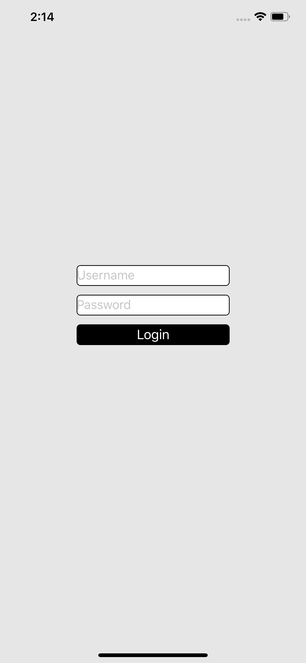
Download the sample project here.